
LOGO, IDENTITY + WEBSITE DESIGN, PACKAGING DESIGN
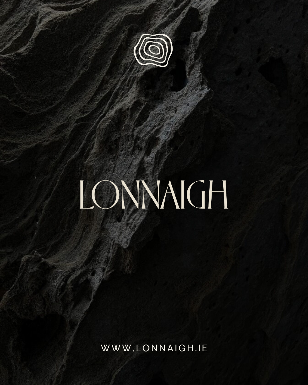
Lonnaigh

Founder Kamile Lyne came to us with a clear and purposeful idea - to create a sustainable alternative to everyday cleaning products that perform beautifully and look considered in any home. Together, we built a brand that reflects that balance.
The identity takes cues from stone carving - slow, intentional, and lasting. We drew inspiration from the Irish landscape, echoing the soft lines and natural layering of topographic forms. The result is a brand that feels clean, calm, and grounded – a minimal system with quiet texture and depth, extending through colour, typography, and digital experience.
LONNAIGH launches with two products: a nourishing hand soap and a plant-based dish soap. Both are designed to elevate everyday routines through thoughtful design and clean formulations. We are currently working together on bringing the brand to life in it's brand-aligned packaging.
This collaboration was a joy to create - a meeting of craftsmanship and care.